

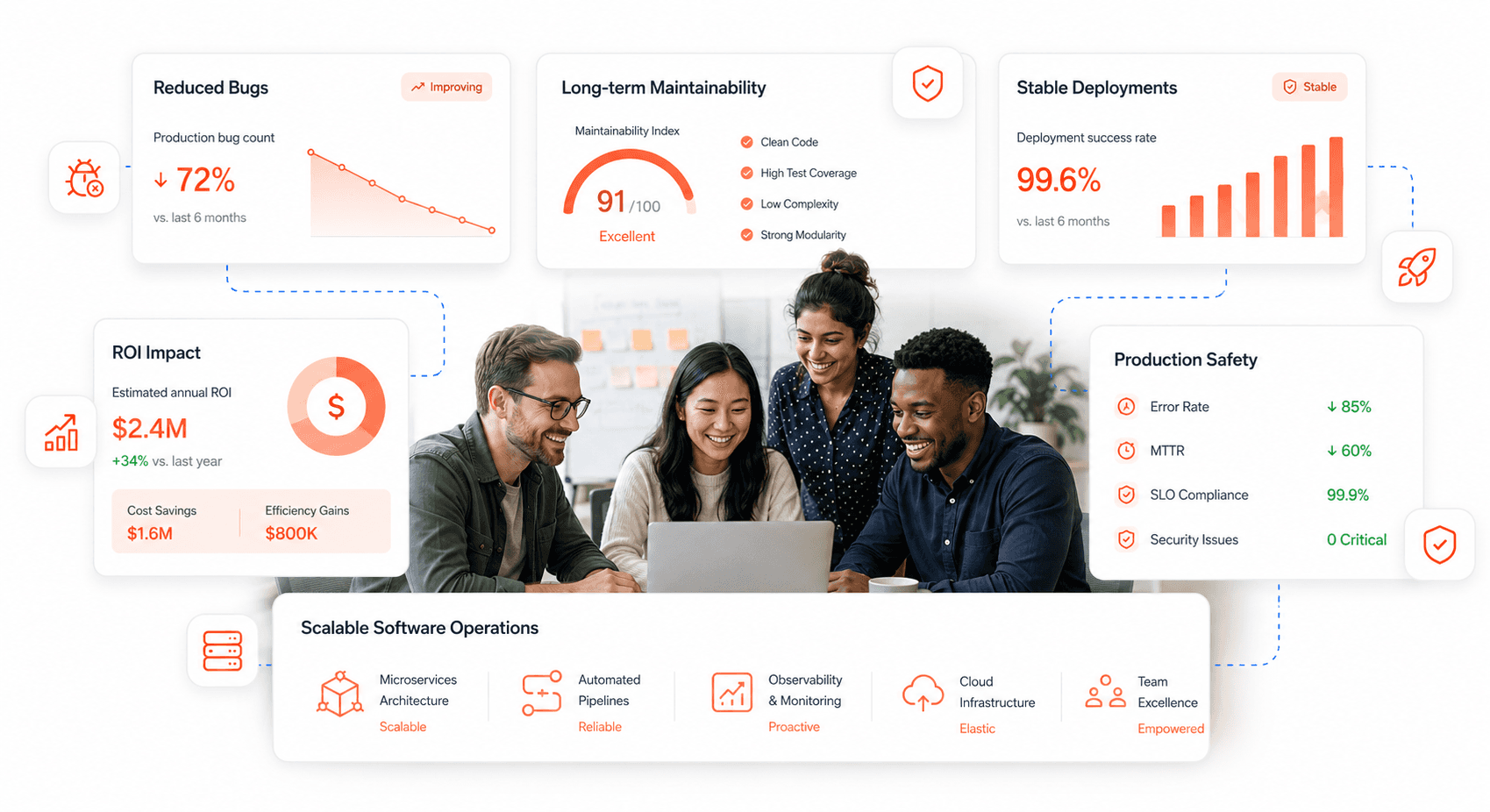
Onboarding is where a SaaS product earns or loses its new users. This guide shows UX designers, product managers and growth teams how to design SaaS onboarding UX that gets people to their first real result quickly, and how to measure whether it is working.
New users need clear direction the first time they open your product. Without it, many leave before they discover what makes the product valuable. This guide walks through practical onboarding strategies that improve activation and reduce early churn, with extra detail for B2B SaaS teams, where onboarding involves whole workspaces rather than one person.
You will learn how to design onboarding flows for different user needs, avoid common mistakes that stall activation, set activation metrics and time-to-value targets, and handle multi-user setup, SSO and security checks without adding friction. We also cover gamification, device-specific design and the testing methods that keep an onboarding flow improving.
Onboarding UX Design Fundamentals for SaaS
Quick answer: Good SaaS onboarding UX gets each new user to one meaningful outcome, the activation event, as fast as possible. Ask only for essential information, personalise the path by role, guide people with a short checklist and in-context tips rather than long tours, remove friction from sign-in and setup, and measure activation rate and time-to-value, not tour completion.
What Is Onboarding UX Design?
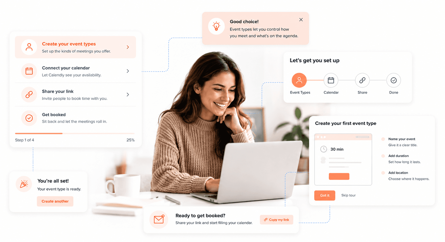
Onboarding UX design is the bridge between acquiring a user and keeping them. When someone signs up for your SaaS product or downloads your app, they are effectively asking you to show them what it can do. That first session often decides whether they come back.
Think of onboarding as a guided tour of your product's value proposition. Users arrive with specific goals and problems they want to solve. Your job is to help them achieve that first moment of success as quickly as possible. This "aha moment" transforms curious visitors into engaged users who see real value in what you're offering.
This matters because free trials and freemium plans only convert when people experience value early. A user who never reaches a first result has little reason to return, and in B2B SaaS a stalled trial usually means a stalled deal. Onboarding is one of the most controllable causes of that early drop-off; our guide to why SaaS users leave covers the wider churn picture.
For SaaS products specifically, onboarding performance is inseparable from the broader new product development process. Teams that build onboarding into their product strategy from day one consistently outperform those that treat it as a post-launch fix.
Smart onboarding doesn't just explain features; it demonstrates value. Instead of overwhelming users with every possible capability, effective onboarding focuses on the core actions that deliver immediate benefits. This approach builds confidence and momentum, encouraging users to explore deeper functionality once they've experienced initial success.
If your product's onboarding is losing users before they reach that first moment of value, Hashbyt's frontend modernisation service diagnoses and fixes the interface layer causing the drop-off, without touching your backend.
Key Elements of an Effective Onboarding Process
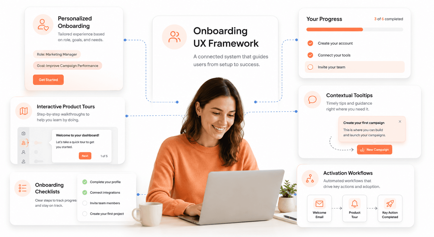
An effective onboarding experience balances speed with comprehension, guiding users through essential steps without creating friction. Progressive disclosure stands as the foundation of smart onboarding design. This technique reveals information and functionality gradually, preventing cognitive overload while building user confidence step by step.
Personalization transforms generic experiences into relevant journeys. A structured UX audit process run before onboarding redesign reveals exactly which user segments are experiencing the most friction and which workflows need the most attention. Collecting basic information about user goals, experience levels, or use cases allows you to customize the onboarding path. A project manager and a freelance designer using the same tool need different guidance and feature priorities.
Interactive elements usually teach better than passive tutorials. Hands-on experiences where users actually perform tasks within your interface create stronger learning retention than watching videos or reading instructions. These guided actions help users build muscle memory and familiarity with your product's interface.
Clear progress indicators reduce anxiety and abandonment. Users want to know where they are in the process and how much time investment remains. Visual progress bars, checklists, or step counters set proper expectations and encourage completion.
Context-sensitive help appears exactly when and where users need it. Instead of front-loading all information, smart onboarding provides just-in-time guidance through tooltips, hotspots, or contextual prompts that activate when users encounter new features.
Common Challenges in Onboarding UX Design
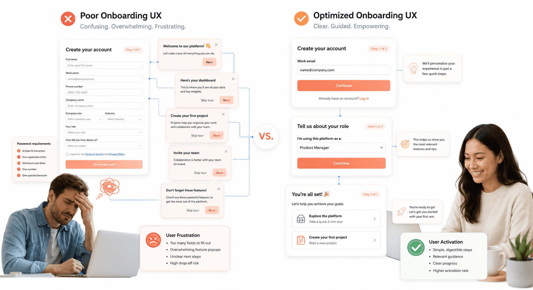
Feature showcase syndrome plagues many onboarding experiences. Teams get excited about demonstrating every capability, creating lengthy tours that overwhelm users before they understand basic value. This approach often backfires, causing users to abandon the process before completing essential setup tasks.
One-size-fits-all onboarding ignores user diversity. Different user segments have varying experience levels, goals, and time constraints. A CEO evaluating software needs different information than the end user who will operate it daily. Generic onboarding fails to address these distinct needs effectively.
Technical friction creates unnecessary barriers. Requiring extensive form completion, email verification, or complex password requirements before users experience any value tests their commitment prematurely. Smart onboarding minimizes upfront friction while collecting necessary information progressively.
Mobile optimization often gets treated as an afterthought. Desktop-first onboarding experiences rarely translate well to mobile devices, where screen space is limited and interaction patterns differ significantly. Touch targets, text sizing, and navigation patterns require mobile-specific consideration.
Information architecture problems surface quickly during onboarding. If users struggle to understand your product's structure during guided introduction, they'll face even greater challenges during independent use. Onboarding often reveals deeper usability issues that require fundamental design improvements.
How to Measure the Success of an Onboarding Experience
Completion rates provide the most straightforward success metric. Track what percentage of users finish your onboarding sequence and identify specific steps where significant drop-offs occur. This data reveals friction points and helps prioritize improvement efforts.
Time to value measures how quickly users achieve meaningful outcomes. This varies by product: it might be sending their first email campaign, completing a project task, or making their first purchase. Shorter time to value typically correlates with higher long-term retention.
Activation metrics go beyond completion to measure actual engagement. Look at how many users perform core actions within their first session or week. These behaviors indicate genuine understanding and value perception rather than just clicking through required steps.
User feedback provides qualitative insights that numbers alone can't capture. Post-onboarding surveys, user interviews, and support ticket analysis reveal specific pain points and confusion areas. Pay special attention to users who abandoned the process; their feedback is particularly valuable.
Long-term retention connects onboarding effectiveness to business outcomes. Track user behavior weeks and months after onboarding completion. Strong onboarding experiences create users who remain active, upgrade to paid plans, and recommend your product to others.
Best Practices for Designing an Onboarding Flow
Start with user research to understand real needs and expectations. Interview recent users about their goals, concerns, and previous experiences with similar products. This research reveals what information users actually need versus what teams assume they need.
Map out different user journeys based on your research findings. Create distinct onboarding paths for different user types, experience levels, or use cases. This segmentation allows for more relevant and efficient experiences.
Prototype and test early versions with real users. Paper prototypes or simple wireframes help validate flow logic before investing in detailed design and development. Watch users attempt to complete tasks and note where confusion or hesitation occurs.
Design for multiple learning styles by combining different instructional methods. Some users prefer reading, others learn better through video, and many benefit from hands-on practice. Offer multiple ways to consume onboarding information when possible.
Understanding the foundational principles of UI design provides the visual hierarchy and interaction framework that effective onboarding flows are built on.
Create clear exit and re-entry points. Some users need to pause onboarding to gather information or get approvals. Make it easy to save progress and return later without losing context or starting over completely.
Focus on emotional design alongside functional requirements. Use encouraging copy, celebrate small wins, and maintain an optimistic tone throughout the experience. Positive emotions during onboarding create stronger product associations and increase completion likelihood.
B2B SaaS Onboarding: Activation Metrics and Multi-User Setup
Most onboarding advice assumes one person signing up for one app. B2B SaaS is different: an account is usually a workspace shared by several people with different roles, and value often depends on setup work such as connecting data or inviting colleagues. That changes what you measure and what you design.
Define the activation event and time-to-value
Your activation event is the first action that reliably signals a new user or account has got value, for example publishing a first report, running a first payroll or getting three teammates into a shared project. Choose it by comparing the early behaviour of accounts that stayed with those that churned, then make it the target of your onboarding flow. Time-to-value is the time from sign-up to that event. Track the median rather than the average, so a few slow accounts do not hide the typical experience.
Workspace setup, roles and invites
Split onboarding into an admin path and a member path. The admin who creates the workspace needs to name it, set roles and permissions and invite colleagues, ideally with sensible default roles so they do not have to design a permission model on day one. Invited members should land on a short, role-specific path that skips workspace settings entirely. Prompt invites at the moment they add value, such as when a user shares their first piece of work, rather than only as a setup step.
SSO, MFA and KYC without unnecessary friction
Security checks are part of onboarding in B2B and regulated products, so design them rather than bolting them on. Offer SSO so employees sign in with their company identity, and support passkeys or password managers so nobody has to recall or retype a code. WCAG 2.2's Accessible Authentication (Minimum) criterion asks you not to make people solve, recall or transcribe something to log in. Where KYC or identity checks are required, explain why, show how many steps remain and let users save and return, instead of asking for documents before they have seen the product.
Data import and empty states
An empty dashboard is one of the weakest first screens in B2B software. Offer imports from spreadsheets and the tools teams already use, provide sample data or templates so users can explore before their own data arrives, and design empty states that explain what will appear and link to the single action that fills them. For the commercial side of this, see our guide to customer onboarding process optimisation.
Onboarding element | What to design | What to measure |
|---|---|---|
Activation event | One clear first outcome per role | Activation rate by account and by user |
Time-to-value | Templates, smart defaults, deferred settings | Median time from sign-up to activation |
Workspace and roles | Default roles; separate admin and member paths | Share of accounts with roles configured |
Invites | In-context invite prompts | Invites sent and accepted per account |
SSO and MFA | SSO, passkeys, clear verification copy | Sign-in completion and drop-off at verification |
Data import | Spreadsheet and integration imports, sample data | Share of accounts importing data in week one |
Empty states | An explanation plus one primary action | Clicks from empty state to first action |
Clearer flows also show up in support volume. Hashbyt's redesign of Silver Oak Wealth Advisors' compliance-heavy wealth management platform led to 65% fewer UI-related support tickets, and a wealth-management client reports onboarding completion rising from 43% to 78%, per their Clutch review. If activation is stalling, a UX audit can pinpoint where new accounts drop off, and SaaS UI/UX modernisation can fix the flows behind it.
Understanding User Needs in Onboarding UX
Conducting user research for onboarding UX design
Great user research starts before you even sketch your first wireframe. User interviews are the most useful method here: talk to actual users about their past experiences with similar products, their goals, and their biggest frustrations. The same research methodology applies when evaluating whether your product's interface is creating friction before users even reach onboarding. Our guide on signs your product frontend needs an overhaul covers the UX warning signs that typically surface during this research phase. When interviewing, ask open-ended questions like "Walk me through the last time you tried a new app" or "What made you stop using a product during setup?"
Surveys can help you gather quantitative data from a larger group, especially if you want to understand common pain points across different user segments. Analytics from existing products also tell a useful story: look at where users drop off, which features they use first, and how long they spend on each step.
User testing sessions with competitors' onboarding flows give you valuable insights too. Watch how users navigate through similar experiences and note their reactions, hesitations, and moments of confusion.
Identifying User Personas and Their Onboarding Needs
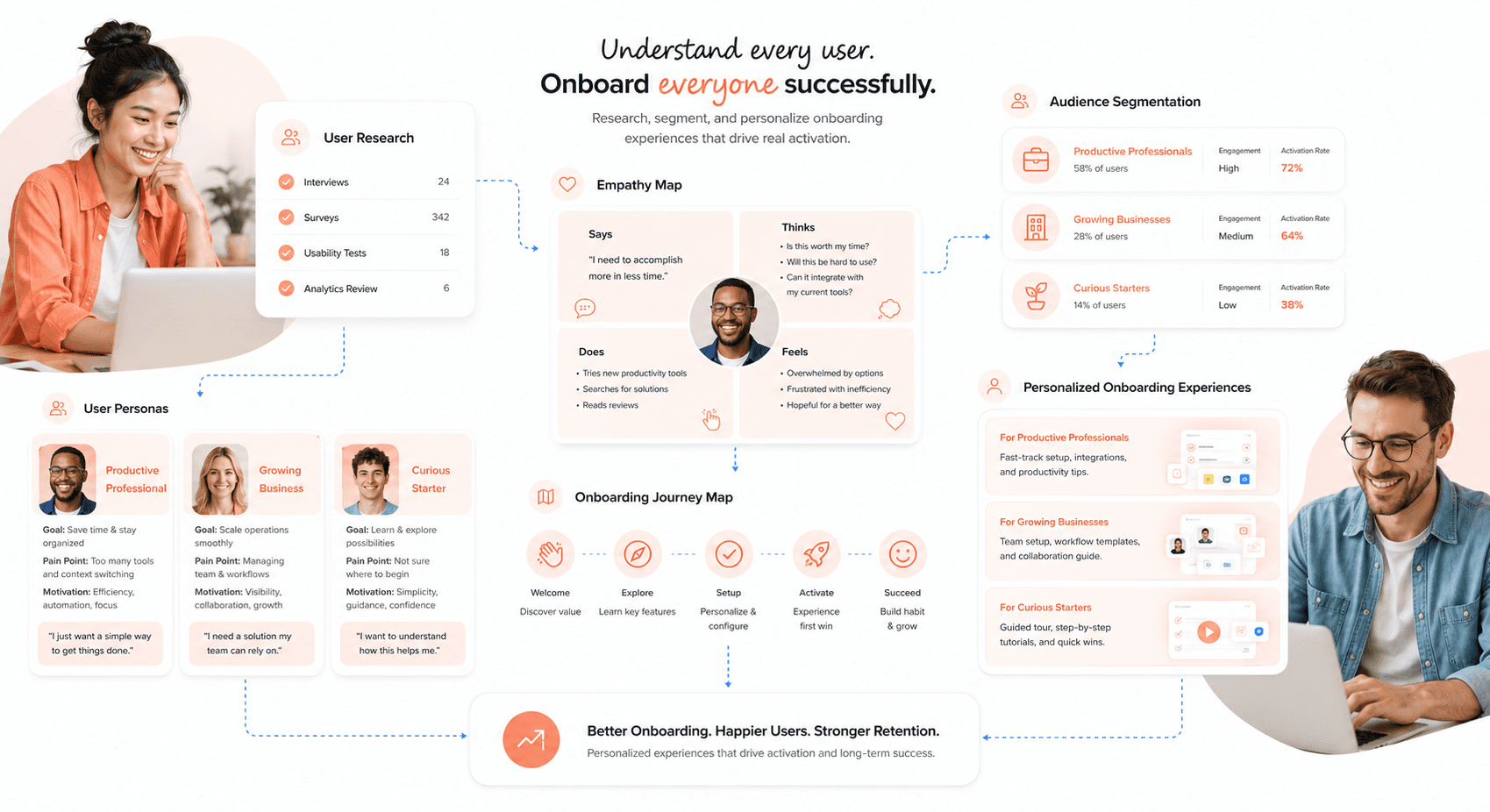
Different users bring different expectations, technical skills, and motivations to your product. A tech-savvy early adopter will race through setup steps that might overwhelm a less experienced user. Create detailed personas that capture not just demographics but also their comfort level with technology, time constraints, and primary goals.
Your "busy executive" persona might need a quick, streamlined experience that gets them to value fast, while your "curious explorer" persona might actually enjoy learning about features during setup. Document each persona's specific needs:
Technical comfort level: Affects how much explanation they need
Time availability: Determines optimal onboarding length
Primary use case: Shapes which features to highlight first
Device preferences: Mobile-first users have different needs than desktop users
Using Empathy Mapping in Onboarding Design
Empathy maps reveal the emotional rollercoaster users experience during onboarding. Create a four-quadrant map for each persona, capturing what they think, feel, see, and do throughout the process.
In the "thinks" section, document internal dialogue like "This looks complicated" or "I hope this works better than the last tool I tried." The "feels" quadrant captures emotions: excitement about new possibilities mixed with anxiety about learning something new.
What users "see" includes your interface elements but also external factors like distractions in their environment or competing priorities. The "do" section maps their actual behaviours: clicking rapidly, reading carefully, or abandoning the process entirely.
Pay special attention to emotional transitions. Users might start excited but become frustrated at step three or feel overwhelmed initially but gain confidence as they progress.
Creating User Journey Maps for Onboarding
Journey maps trace the entire onboarding experience from first touch to activation. Start before users even open your product: include discovery, sign-up triggers, and initial expectations. Map each touchpoint chronologically, noting user actions, thoughts, emotions, and pain points.
Identify critical moments where users might drop off. These often happen when cognitive load spikes, when value isn't immediately clear, or when users feel lost. Mark these as opportunities for intervention.
Include different pathways in your maps since users rarely follow the exact same route. Some might skip tutorials, others might get interrupted halfway through, and power users might try to jump ahead to advanced features.
Your journey map should also capture the technical side: what happens behind the scenes, which systems are involved, and where technical failures might occur.
Incorporating User Feedback Into the Design Process
Set up multiple feedback channels to capture user insights continuously. In-app feedback widgets let users report issues in real-time, while exit surveys catch people who abandon the process. Follow-up emails a few days after onboarding can reveal longer-term frustrations.
Create a systematic way to categorize and prioritize feedback. Group similar complaints together to identify patterns. If multiple users mention that step four is confusing, that's your next design priority. Track both qualitative comments and quantitative metrics like completion rates and time spent on each step.
Regular feedback review sessions with your team help translate user insights into actionable design changes. Bring customer support into these discussions since they often hear directly from frustrated users.
Don't wait for feedback to accumulate. Small, frequent improvements based on user input create a much better experience than major overhauls every few months.
Onboarding UX Strategies for Different Industries
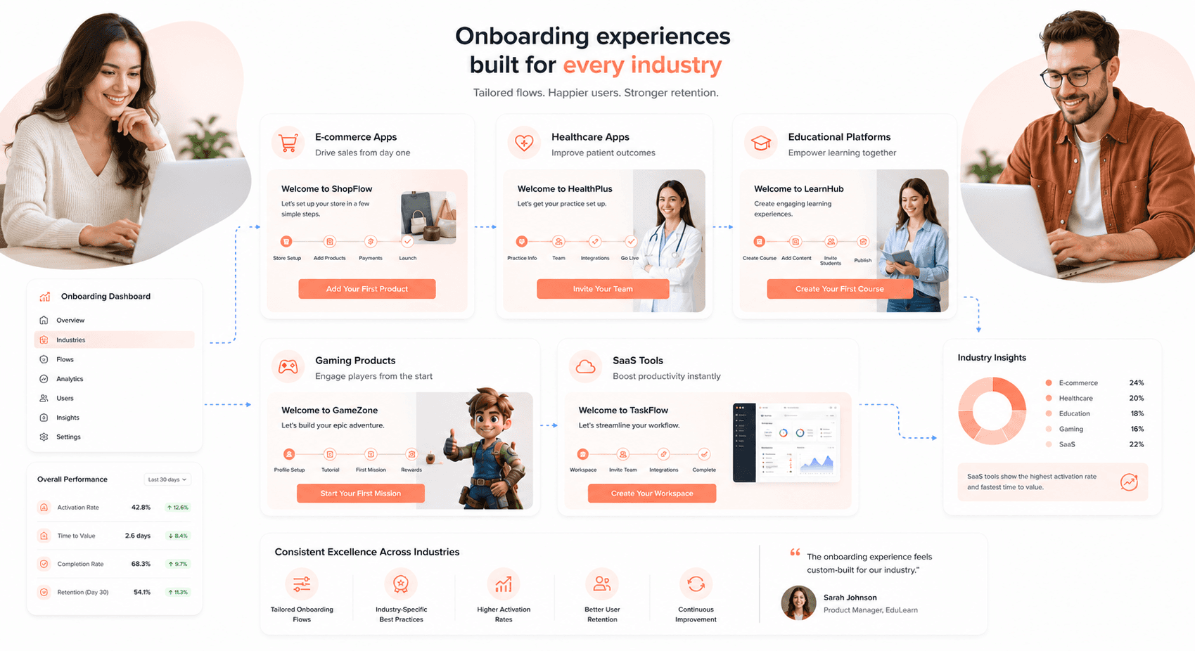
Onboarding best practices for e-commerce platforms
Shopping apps need to build trust fast while showcasing product value. New users want to browse and buy without jumping through hoops. The best approach? Show immediate value through personalized product recommendations based on browsing behavior or location.
Start with social proof: display customer reviews, ratings, and popular items right on the first screen. Users feel more confident when they see others have had positive experiences. Streamline account creation by offering guest checkout or one-click social login options. Nobody wants to fill out lengthy forms when they're excited about a potential purchase.
Progressive disclosure works wonders here. Show essential features first (search, categories and wishlist), then gradually introduce loyalty programmes, notifications and advanced filters.
Mobile-first design is critical because so much shopping now starts on a phone. Use large, thumb-friendly buttons for cart and checkout actions. Implement smart search suggestions and voice search capabilities to reduce friction. Consider adding visual search features where users can photograph items to find similar products.
Designing onboarding experiences for educational apps
Educational apps face unique challenges because users often feel overwhelmed by learning something new. The key lies in breaking complex concepts into digestible chunks while maintaining motivation through quick wins.
Start with a skills assessment or learning goal survey. Users appreciate when apps adapt to their current knowledge level rather than assuming everyone starts from zero. Duolingo excels at this by offering placement tests and allowing users to skip familiar content.
Microlearning principles should guide your onboarding flow. Present bite-sized lessons that users can complete in 3-5 minutes. This approach prevents cognitive overload and builds confidence through achievable milestones. Use progress indicators and celebration animations to acknowledge each small victory.
Let learners do rather than watch. Instead of explaining how flashcards work, let users create their first card immediately. Hands-on experience creates stronger memory connections and helps users understand the app's value proposition viscerally.
Personalization based on learning style preferences can significantly improve engagement. Some users prefer visual content, others learn better through audio, and many need hands-on practice. Offer choices during onboarding that let users customize their learning experience from day one.
Onboarding strategies for healthcare apps
Healthcare apps require special attention to privacy concerns and user anxiety. People downloading health apps often feel vulnerable or worried about their conditions. Your onboarding must address these emotional needs while establishing credibility.
Lead with credentials and certifications prominently displayed. Users need to see that medical professionals have validated your app's content. Include doctor endorsements, clinical study results, or FDA approvals when available. This information belongs on the first screen, not buried in fine print.
Privacy and security explanations should be crystal clear, not hidden in lengthy terms of service. Use plain language to explain how personal health data gets protected. Privacy worries are a common reason people hesitate over health apps, so transparency builds essential trust.
Symptom tracking and medication reminder features benefit from gentle guidance rather than overwhelming feature tours. Show users how to log their first entry step-by-step, then let them explore additional features naturally. MyFitnessPal does this well by focusing on food logging first, then gradually introducing exercise tracking and social features.
Consider offering offline functionality during onboarding demonstrations. Healthcare emergencies don't wait for WiFi connections, and users appreciate knowing they can access critical information anywhere.
Onboarding personalisation in consumer apps
Generic onboarding flows feel impersonal and often miss the mark entirely. Smart personalization starts with understanding why each user downloaded your app and what they hope to accomplish.
Behavioral segmentation during sign-up provides valuable customization opportunities. Ask 2-3 strategic questions about user goals, experience level, or preferred features. Spotify's artist picker is a familiar example: users happily choose favourite artists because they understand the payoff will be better recommendations.
Dynamic content adaptation based on user responses creates immediate relevance. A fitness app might show strength training features to experienced gym users while highlighting beginner workouts for newcomers. This targeted approach increases feature adoption rates significantly.
Location-based personalization can enhance local app experiences. Food delivery apps benefit from showing nearby restaurants, while travel apps can highlight local attractions and weather information. Users feel more connected when apps acknowledge their physical context.
Progressive profiling allows you to gather additional personalization data over time without overwhelming new users. Start with essential information, then request additional details during natural interaction points. LinkedIn masters this technique by asking for more profile information after users experience initial platform value.
Onboarding techniques for social media platforms
Social platforms must solve the "empty room" problem where new users see no content or connections. Cold start scenarios kill engagement before it begins, so focus on populating feeds and friend lists quickly.
Contact syncing and social graph import should happen early with clear value propositions. Users understand sharing contact access when you explain how it helps them reconnect with existing friends. Suggested accounts based on synced contacts work because users immediately see familiar faces.
Content curation during onboarding helps users discover interesting accounts to follow. Rather than showing random popular content, use interest-based recommendations. TikTok's algorithm-driven approach works because users can immediately indicate preferences through likes and skips during the onboarding flow.
Privacy controls deserve prominent placement in social app onboarding. Users want to understand who can see their posts, find their profile, or send them messages. These settings often get buried in account preferences, but early visibility builds trust and reduces privacy anxiety.
Encourage early content creation through low-pressure prompts. Instead of demanding users post original content immediately, suggest sharing or commenting on existing posts. This approach helps users understand platform culture before they contribute their own content.
Onboarding challenges and solutions in gaming
Gaming onboarding walks a tightrope between tutorial necessity and player autonomy. Gamers want to jump into action quickly, but complex games require explanation to prevent frustration and abandonment.
Interactive tutorials usually work better than static instruction screens, because players learn by doing. Well-known games such as Portal introduce mechanics through gameplay rather than separate tutorial modes. Each level teaches new concepts while advancing the narrative, keeping players engaged throughout the learning process.
Difficulty scaling helps accommodate different skill levels without alienating experienced players. Offer skip options for tutorial sections while providing hints and assistance for newer players. Many mobile games use adaptive difficulty that adjusts based on player performance during onboarding levels.
Reward systems during tutorials maintain motivation through the learning curve. Players should earn in-game currency, unlock cosmetic items, or gain abilities while learning basic mechanics. This approach transforms potentially tedious instruction into rewarding progression.
Social features integration can reduce onboarding friction through peer assistance. Show players how to invite friends, join guilds, or access community features early in the experience. Multiplayer games especially benefit from helping users connect with others who can provide guidance and motivation.
Save progress frequently during onboarding sequences. Nothing frustrates players more than losing tutorial progress due to interruptions or technical issues. Implement automatic checkpoints that let players resume exactly where they left off, respecting their time investment in learning your game.
Designing and Optimizing Onboarding Experiences
The Importance of a Clear and Intuitive Onboarding Flow
Your onboarding flow needs to feel like a natural conversation, not a confusing maze. Users should instantly understand where they are, what they need to do next, and why each step matters. Think of it as giving directions to a friend: you would start with the big picture, then break it down into simple, logical steps.
The most effective flows follow a linear progression that matches how people naturally process information. Start with the most critical action that delivers immediate value, then gradually introduce secondary features. Each screen should have one primary goal and a clear call-to-action that stands out visually.
Visual hierarchy plays a huge role here. Use contrasting colors, appropriate font sizes, and plenty of whitespace to guide attention where you want it. Progress indicators help users see how much they've accomplished and what's left, reducing anxiety about the unknown.
Consider the emotional journey alongside the functional one. Users often feel overwhelmed when starting something new, so your design should feel reassuring and supportive rather than demanding or rushed.
Strategies for Reducing Friction in the Onboarding Process
Friction is one of the most common reasons new users abandon onboarding. Every extra click, confusing label, or unnecessary field pushes users closer to abandoning your product. The key is identifying and eliminating these roadblocks systematically.
Start by minimizing required information upfront. Ask only for what you absolutely need to get users started, then collect additional details over time. Instead of a lengthy registration form, consider social login options or allowing users to explore before committing to an account.
Common friction points to address:
Loading times: Optimize images and minimize heavy animations during critical steps
Complex passwords: Offer simple requirements or passwordless options
Unclear error messages: Write helpful, specific guidance instead of generic warnings
Mobile responsiveness: Ensure every element works perfectly on smaller screens
Too many choices: Limit options to prevent decision paralysis
Smart defaults can dramatically reduce cognitive load. Pre-fill forms with sensible choices based on user behavior or location. For example, auto-detect time zones, suggest common job titles, or set popular features as enabled by default.
Using Progressive Onboarding to Keep Users Engaged
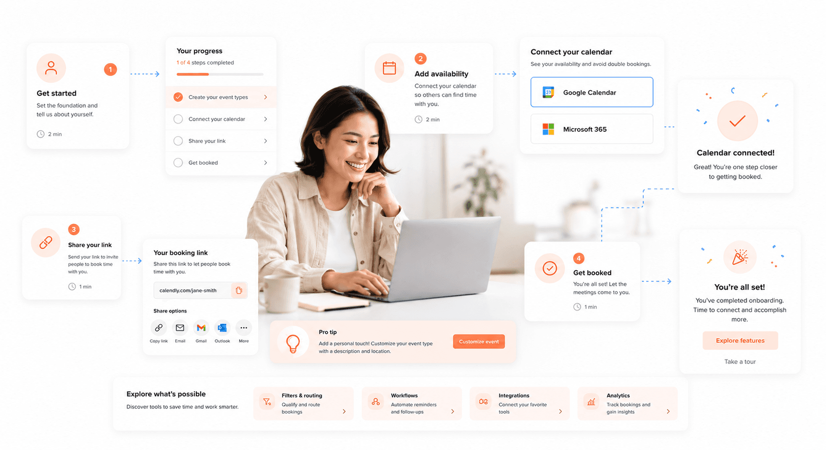
Progressive onboarding spreads the learning curve across multiple sessions, preventing information overload on day one. This approach recognizes that users need time to absorb new concepts and build confidence gradually.
Start with the core workflow that delivers your product's main value proposition. Once users successfully complete this primary task, introduce related features contextually when they're most relevant. This creates natural learning moments tied to actual usage rather than abstract tutorials.
Effective progressive onboarding techniques:
Feature spotlights: Highlight new capabilities when users reach relevant sections
Contextual tips: Show helpful hints based on current user actions
Achievement unlocking: Reveal advanced features after users master basics
Just-in-time tutorials: Provide guidance exactly when users need it
The timing matters enormously. Watch for behavioral triggers that indicate readiness for the next level. Maybe someone who successfully creates their first project is ready to learn about collaboration tools, or a user who uploads multiple files might benefit from batch processing features.
Track engagement metrics at each stage to identify where users get stuck or lose interest. This data helps you refine the pacing and content of your progressive reveals.
Creating a Personalised Onboarding Experience
Generic onboarding treats everyone the same, but your users have different goals, experience levels, and preferences. Personalization makes the experience feel crafted specifically for each individual, increasing engagement and success rates.
Start with simple segmentation during initial signup. Ask about their role, company size, or primary use case. This information lets you customize the entire flow to match their specific needs and skip irrelevant features.
Personalization strategies that work:
Role-based paths: Create different workflows for managers, team members, and administrators
Experience-level adaptation: Offer detailed guidance for beginners, shortcuts for experts
Industry-specific examples: Show relevant use cases and templates for their field
Goal-oriented setup: Focus on features that help achieve their stated objectives
Behavioral personalization takes this further by adapting in real-time based on user actions. Someone who quickly navigates through setup screens might prefer a faster pace, while someone who spends time reading each step benefits from more detailed explanations.
Consider using progressive profiling to gather personalization data gradually rather than overwhelming users with questions upfront. Each interaction provides insights you can use to refine their experience.
Tips for Incorporating Branding into the Onboarding Design
Your onboarding is often a user's first real interaction with your brand personality. This is your chance to build emotional connection alongside functional understanding. The key is weaving brand elements naturally into the experience without overshadowing usability.
Visual consistency starts with your core brand elements: colours, typography, and imagery style. But branding goes deeper than aesthetics. Your tone of voice, interaction patterns, and even error messages should reflect your brand personality. A playful startup might use casual language and fun animations, while an enterprise tool maintains professionalism with clear, confident messaging.
Brand integration opportunities:
Element | Branding Approach | Example |
|---|---|---|
Illustrations | Custom graphics matching brand style | Unique character mascots vs. generic icons |
Microcopy | Voice and tone consistency | "Let's get started!" vs. "Begin setup process" |
Success states | Branded celebrations | Custom animations vs. standard checkmarks |
Empty states | Encouraging messaging | Helpful suggestions vs. blank screens |
Don't let branding compromise clarity. Your logo doesn't need to appear on every screen, and branded colors shouldn't make important buttons hard to see. The best branded onboarding feels distinctly yours while remaining completely intuitive to use.
Consider creating brand moments that delight without distracting. A subtle animation when users complete a step, personalized congratulations messages, or themed illustrations can reinforce your brand identity while celebrating user progress.
Incorporating Gamification in Onboarding UX Design
The psychology behind gamification in onboarding
Game elements draw on well-understood motivations: a sense of progress, competence and recognition. A progress bar that fills up or a badge for completing a profile gives users clear feedback on what they have achieved, the same kind of loop that keeps people engaged in games.
The psychology works on multiple levels. Achievement mechanics satisfy our need for competence and mastery. Social elements like leaderboards trigger our competitive instincts and desire for recognition. Progress indicators provide clear feedback loops, showing users exactly where they stand and what comes next.
Cognitive load theory also plays a crucial role here. Breaking complex onboarding into bite-sized, game-like challenges makes the process feel less overwhelming. Instead of facing a massive form to complete, users tackle small quests that build momentum and confidence. This approach reduces anxiety while creating positive associations with your product from the very first interaction.
The key insight is that gamification doesn't just make onboarding more fun, it makes it more effective by working with natural human psychology rather than against it.
Different types of game elements to use in onboarding
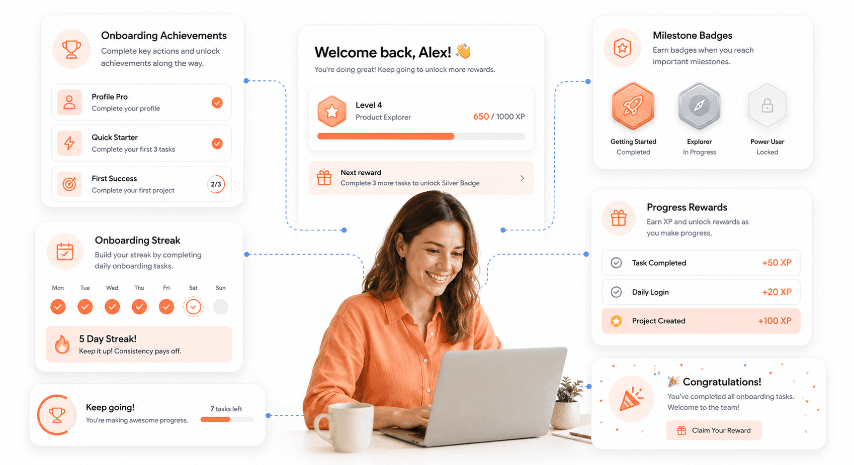
Progress and Achievement Systems
Progress bars showing completion percentage
Milestone celebrations when users reach specific goals
Achievement badges for completing key actions
Experience points (XP) systems that accumulate over time
Level progression that unlocks new features
Interactive Elements
Tutorial quests that guide users through features
Drag-and-drop activities for hands-on learning
Interactive hotspots that reveal information when clicked
Mini-games that teach product functionality
Scratch-off reveals for discovering features
Social Gaming Mechanics
Sharing achievements on social platforms
Referral challenges with rewards
Team-based onboarding for business accounts
Community challenges for new users
Peer comparison without creating negative pressure
Narrative Elements
Character-guided tours through your product
Story-driven tutorials that unfold over time
Choose-your-own-adventure style setup flows
Personalized journeys based on user goals
Mission-based learning paths
The most effective approaches combine multiple elements rather than relying on a single mechanic. A progress bar paired with achievement badges and milestone celebrations creates a richer experience than any single element alone.
Designing rewards and incentives to motivate users
Effective reward systems balance intrinsic and extrinsic motivation. Intrinsic rewards like mastery, autonomy, and purpose tend to create longer-lasting engagement than purely external incentives.
Timing Your Rewards
Early wins matter most. Front-load easy achievements to build momentum, then gradually increase the challenge. Aim for the first reward to arrive early in the first session. This creates an immediate positive feedback loop that encourages continued engagement.
Types of Meaningful Rewards
Functional rewards: Early access to premium features, increased storage limits, or exclusive capabilities
Recognition rewards: Public badges, certificates, or social sharing opportunities
Personalization rewards: Custom themes, profile decorations, or personalized content
Social rewards: Community access, networking opportunities, or collaboration features
Educational rewards: Advanced tutorials, insider tips, or expert content
Progressive Disclosure Strategy
Reveal rewards gradually to maintain interest. Don't show users everything they can earn upfront; mystery and discovery keep people engaged. Create reward tiers that unlock new possibilities as users advance through onboarding.
Avoid the over-justification effect where external rewards actually reduce intrinsic motivation. Focus on celebrating users' progress and achievements rather than bribing them to complete tasks.
Examples of successful gamified onboarding experiences
Duolingo's Language Learning Journey
Duolingo masterfully uses streaks, XP points, and leagues to make language learning addictive. New users immediately start earning points for basic lessons, and the streak counter creates daily engagement habits. The owl mascot adds personality while gentle push notifications maintain momentum without being annoying.
LinkedIn's Profile Completion Prompts
LinkedIn prompts new members to add a photo, experience and skills one section at a time. Each completed section gives immediate visual feedback and a clear next step, turning a long form into a series of small, visible wins.
Asana's Unicorn Celebrations
When users complete tasks in Asana, animated unicorns occasionally fly across the screen. This unexpected delight creates positive emotional associations with productivity. The rare, unpredictable nature of these celebrations makes them more special than constant rewards.
Spotify's Discover Weekly Achievement
Spotify frames personalised playlists such as Discover Weekly as a reward for listening, which makes exploration feel like an achievement. The personalized playlists feel like rewards for engaging with the platform, while social sharing capabilities let users show off their musical discoveries.
Headspace's Meditation Streaks
Headspace tracks consecutive days of meditation with visual streak counters and milestone celebrations. The app rewards consistency rather than perfection, encouraging sustainable habits over intense short-term usage.
These examples work because they align game mechanics with genuine user value rather than adding superficial point systems.
Ethical considerations when using gamification in onboarding
Gamification carries responsibility. The same psychological triggers that create engaging experiences can also manipulate users into behaviors that don't serve their best interests.
Accessibility is equally non-negotiable in this context. Gamification elements that work for most users can create barriers for others. Our guide to medical device user interface design shows how inclusive design principles are applied where the stakes are highest, and the same thinking carries over to gamified onboarding.
Avoiding Dark Patterns
Never use gamification to trick users into unwanted actions. Fake urgency timers, manipulative social pressure, or rewards that require excessive personal data collection cross ethical lines. The goal should always be helping users succeed with your product, not extracting maximum value from them.
Respecting User Agency
Effective gamification enhances user choice rather than replacing it. Provide clear options to skip game elements for users who prefer straightforward experiences. Some people find gamification patronizing or distracting; respect these preferences.
Preventing Addictive Design
Monitor your metrics for signs of compulsive usage patterns. If users are completing onboarding multiple times or showing other concerning behaviors, adjust your approach. Healthy engagement looks different from addiction.
Data Privacy in Gamified Systems
Gamification often requires collecting behavioral data to personalize rewards and track progress. Be transparent about what you're tracking and why. Give users control over their gamification data and respect their privacy choices.
Inclusive Design Principles
Consider how gamification affects different user groups. Competitive elements might alienate some cultures or age groups. Achievement-focused systems could frustrate users with disabilities or time constraints. Design inclusive alternatives that provide value for diverse user needs.
The best gamified onboarding creates genuine value for users while building positive relationships with your brand. When done ethically, gamification helps people accomplish their goals more effectively and enjoyably.
Onboarding for Different Devices and Platforms
Designing for onboarding on mobile devices
Mobile onboarding requires a completely different approach than desktop experiences. Screen real estate is precious, and users have little patience for lengthy tutorials. The key is progressive disclosure: reveal features gradually rather than overwhelming users with everything upfront.
Touch-first design principles should guide every decision. Interactive hotspots work better than static tooltips, and swipe gestures feel more natural than clicking through multiple screens. Keep onboarding flows to 3-5 screens maximum, with each screen focusing on one core concept.
Consider the context of mobile usage. People often multitask while using mobile apps, so your onboarding should accommodate interruptions. Auto-save progress and allow users to skip sections they can revisit later. Push notifications can gently guide users back to complete their setup without being pushy.
Popular patterns include:
Progressive onboarding: Introduce features contextually during actual usage
Empty states: Guide users to their first action through well-designed placeholder content
Interactive tutorials: Let users experience features hands-on rather than just reading about them
Benefit-focused messaging: Show value before explaining mechanics
Onboarding considerations for desktop and web applications
Desktop and web applications offer more screen space but face different challenges. Users expect more functionality and often have specific tasks in mind when they arrive. The onboarding should respect their time while ensuring they discover key features that drive long-term engagement.
Multi-step forms work well on desktop but should include clear progress indicators and the ability to save drafts. Consider offering multiple entry points: some users prefer guided tours, others want to jump straight into the product with contextual help available on demand.
Keyboard navigation becomes crucial for power users. Every interactive element in your onboarding should be accessible via keyboard shortcuts. This not only improves accessibility but also appeals to users who prefer efficient, mouse-free workflows.
Desktop onboarding can leverage:
Sidebar guidance: Persistent help that doesn't interrupt the main workflow
Contextual tooltips: Just-in-time information that appears when users hover over features
Smart defaults: Pre-populate forms and settings based on industry or role selection
Feature discovery: Use subtle animations to draw attention to powerful features users might miss
Creating a seamless cross-platform onboarding experience
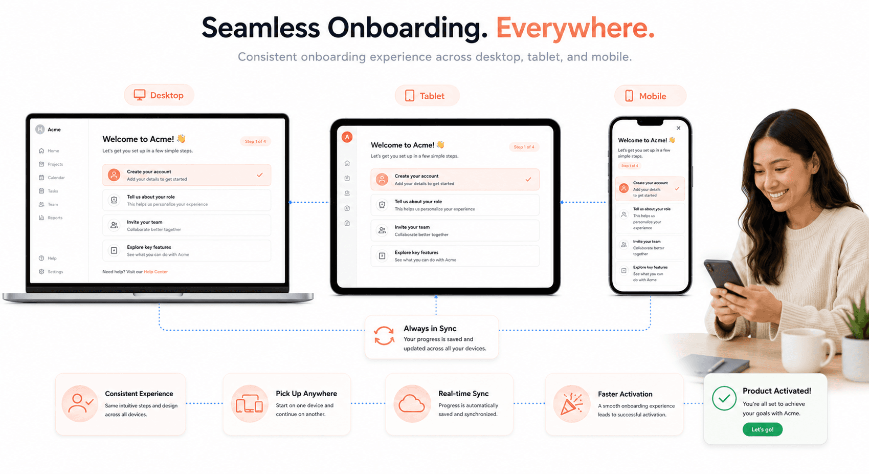
Users expect their experience to be consistent whether they start on mobile and switch to desktop, or vice versa. The challenge lies in maintaining continuity while respecting each platform's unique constraints and conventions.
Start by identifying the core onboarding journey that remains constant across platforms. These fundamental steps should use similar language, visual hierarchy, and logical flow. Platform-specific adaptations should feel like natural extensions rather than completely different experiences.
Sync progress across devices using cloud storage or user accounts. Nothing frustrates users more than repeating onboarding steps they've already completed on another device. Build smart detection that recognizes returning users and adapts the experience accordingly.
Design your content to be modular. Break onboarding information into bite-sized pieces that can be rearranged or reformatted for different screen sizes. A three-column layout on desktop might become a vertical stack on mobile, but the content chunks remain the same.
Cross-platform consistency checklist:
Element | Desktop Approach | Mobile Adaptation | Web Considerations |
|---|---|---|---|
Navigation | Horizontal tabs | Bottom tabs or hamburger | Responsive navigation |
Forms | Multi-column layouts | Single column, larger inputs | Adaptive based on viewport |
Media | High-resolution images | Optimized for data usage | Progressive loading |
Interactions | Hover states | Touch-friendly targets | Both touch and mouse support |
Strategies for onboarding in virtual and augmented reality
VR and AR onboarding presents unique challenges since traditional UI patterns don't translate directly to immersive environments. Users need time to adjust to the medium itself before they can focus on your specific application.
Start with comfort and orientation. Many first-time VR users experience motion sickness or disorientation. Your onboarding should begin in a calm, stationary environment with gentle movements and clear spatial references. Gradually introduce more complex interactions as users become comfortable.
Hand tracking and gesture controls require special attention. Users can't see their real hands, so provide clear visual feedback for every interaction. Ghost hands or outline representations help users understand where their hands are in virtual space.
Audio becomes incredibly important in immersive environments. Spatial audio cues can guide users more effectively than visual indicators alone. A friendly voice guide feels natural and helps users feel less isolated in virtual spaces.
VR/AR onboarding best practices:
Comfort-first design: Always prioritize user physical comfort
Clear visual feedback: Show users exactly how their actions affect the virtual environment
Practice playground: Create safe spaces where users can experiment with controls
Gradual complexity: Introduce advanced features only after users master basics
Exit strategies: Always provide clear ways to pause or exit the experience
Accessibility and inclusivity in onboarding design
Inclusive onboarding means designing for the full spectrum of human diversity, not just adding accessibility as an afterthought. Start by considering users with different abilities, cultural backgrounds, technical skills, and device capabilities.
Screen readers need structured, semantic markup to navigate onboarding flows effectively. Use proper heading hierarchies, alt text for images, and descriptive link text. Avoid relying solely on color to convey information; use icons, text labels, and patterns as backup communication methods.
Cognitive accessibility often gets overlooked but affects everyone. Use plain language, provide clear instructions, and avoid time pressures unless absolutely necessary. Some users need more time to process information or complete tasks.
Motor accessibility considerations include larger touch targets, keyboard navigation options, and voice control compatibility. Design for one-handed use and consider users with limited dexterity or strength.
Inclusive design principles:
Multiple communication channels: Don't rely on just visual, audio, or text alone
Flexible pacing: Let users control the speed of onboarding
Cultural sensitivity: Use inclusive imagery and avoid assumptions about user backgrounds
Language support: Provide multiple language options and avoid complex terminology
Technology awareness: Consider users with older devices or slower internet connections
Test your onboarding with real users from diverse backgrounds. Automated accessibility checkers catch technical issues but miss experiential problems that only human testing can reveal.
Collaborating on Onboarding Design
The role of different team members in onboarding design
Product managers drive the strategic vision for onboarding experiences, defining key metrics and user journey milestones. They work closely with UX designers who craft intuitive flows and visual interfaces that guide users through their first interactions. Developers bring these designs to life while ensuring technical feasibility and performance optimization.
Content strategists shape the messaging and microcopy that appears throughout the onboarding process, making complex features digestible for new users. Marketing teams provide valuable insights into user personas and acquisition channels, helping design teams understand who's arriving and why.
Customer support representatives offer crucial feedback about common user pain points and frequently asked questions during onboarding. Their frontline experience reveals gaps between designed experiences and real user behavior.
Data analysts track engagement metrics, drop-off rates, and conversion funnels to identify improvement opportunities. Quality assurance teams ensure the onboarding experience works seamlessly across different devices and scenarios.
Role | Primary Contribution | Key Deliverables |
|---|---|---|
Product Manager | Strategic direction and metrics | Requirements, success criteria |
UX Designer | User experience and interface design | Wireframes, prototypes, user flows |
Content Strategist | Messaging and microcopy | Copy guidelines, error messages |
Developer | Technical implementation | Functional onboarding features |
Data Analyst | Performance insights | Metrics dashboards, A/B test results |
Efficient collaboration tools and techniques for onboarding projects
Design collaboration starts with shared workspaces where team members can access the latest prototypes, user research, and project updates. Tools like Figma and Miro enable real-time collaboration on wireframes and user journey maps, allowing multiple stakeholders to contribute simultaneously.
Project management platforms help coordinate timelines and dependencies across different team functions. Daily standups keep everyone aligned on progress and blockers, while dedicated Slack channels facilitate quick questions and updates.
Design systems accelerate onboarding projects by providing pre-built components and patterns. Teams can focus on user experience challenges rather than recreating basic interface elements. Version control becomes essential when multiple designers work on the same onboarding flow.
Shared documentation repositories maintain consistency in requirements, user research findings, and design decisions. Regular cross-functional workshops bring different perspectives together to solve complex onboarding challenges.
Essential collaboration techniques:
Weekly design syncs with all stakeholders present
Shared component libraries for consistent UI elements
Collaborative user story mapping sessions
Joint user testing sessions with observers from different teams
Integrated feedback loops between design and development sprints
Conducting design critiques and user feedback sessions
Design critiques transform subjective opinions into actionable improvements. Structure these sessions around specific user scenarios rather than abstract design principles. Present onboarding flows in context, showing how users would actually encounter each screen or interaction.
Invite diverse perspectives by including team members who weren't involved in the original design process. Fresh eyes often catch assumptions that design teams miss. Set clear critique objectives beforehand - are you evaluating usability, visual hierarchy, or content clarity?
User feedback sessions reveal the gap between intended design and actual user behavior. Conduct these sessions with real users who match your target personas, not internal team members. Screen sharing tools allow remote observation while maintaining user comfort.
Create feedback collection frameworks that capture both qualitative insights and quantitative metrics. Ask users to think aloud during onboarding tasks, then follow up with targeted questions about specific moments of confusion or delight.
Effective critique formats:
Walking through user scenarios step-by-step
Comparing alternative design approaches side-by-side
Focusing on specific interaction patterns or visual elements
Time-boxed sessions with clear agendas and outcomes
Follow-up action items with assigned owners and deadlines
Managing conflicts and making decisions in onboarding design
Design conflicts often arise from competing priorities between user experience and business objectives. Marketing wants prominent feature callouts while UX designers advocate for minimal cognitive load. Resolve these tensions by returning to user research data and established success metrics.
Establish decision-making frameworks before conflicts emerge. Define who has final authority for different types of design decisions, whether that's the product manager for strategic direction or the UX lead for interaction patterns. Document these frameworks so team members understand the escalation process.
Use data to depersonalize disagreements. When team members disagree about onboarding approaches, propose quick prototypes or A/B tests to validate different hypotheses. Let user behavior guide decisions rather than internal preferences.
Time-box debates to prevent endless discussions that slow down project progress. Set specific deadlines for reaching consensus, and have backup decision-makers ready when teams can't agree.
Create decision logs that capture the reasoning behind major onboarding choices. Future team members can understand why certain approaches were selected, preventing the same debates from recurring.
Best practices for remote collaboration on onboarding projects
Remote onboarding design requires more intentional communication than in-person work. Over-document design decisions, user research insights, and project context so team members can contribute effectively regardless of timezone differences.
Asynchronous collaboration becomes essential when teams span multiple locations. Design tools with commenting features allow feedback collection without requiring simultaneous presence. Record design walkthroughs and user testing sessions for team members who can't attend live.
Regular video check-ins maintain team cohesion and prevent miscommunication. Screen sharing during these sessions helps align understanding of complex user flows or interaction details. Virtual whiteboarding tools recreate the collaborative energy of in-person brainstorming.
Remote collaboration essentials:
Detailed design documentation with rationale explanations
Recorded user testing sessions with timestamps for key insights
Shared calendars showing team member availability across timezones
Clear handoff processes between design and development phases
Virtual office hours for spontaneous collaboration and questions
Establish communication norms that respect different working styles and schedules. Some team members prefer detailed written feedback while others communicate better through quick video messages. Accommodate these preferences while maintaining project momentum.
A/B Testing and Iteration in Onboarding Design
The Importance of A/B Testing in Onboarding Design
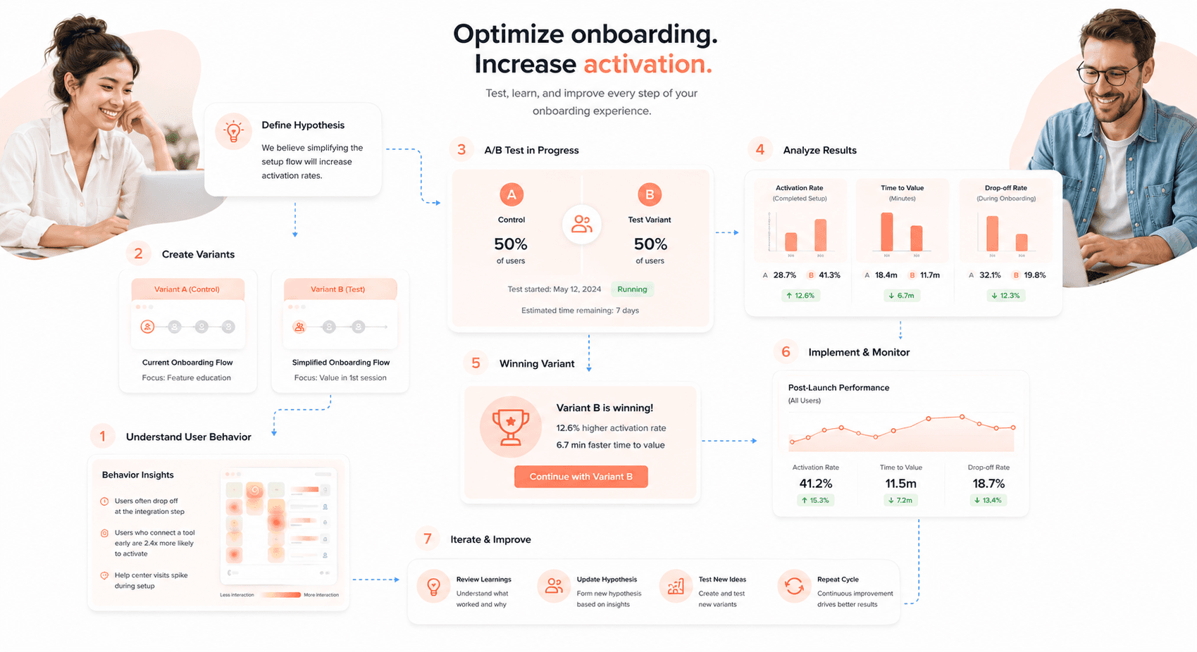
A/B testing transforms onboarding from guesswork into data-driven decision making. The same data-driven approach applies across your broader product experience. Our guide to AI-driven UI/UX design for SaaS covers how AI-assisted analysis is accelerating the pattern detection that traditionally required weeks of manual A/B testing.
When you test different versions of your onboarding flow against each other, you discover what actually works versus what you think should work. User behavior often surprises even experienced designers, making A/B testing essential for creating truly effective onboarding experiences.
The real power of A/B testing lies in its ability to isolate specific elements that impact user conversion and retention. You might find that a single copy change lifts completion, or that removing one step from sign-up reduces abandonment more than a full redesign would. These insights become the foundation for optimizing every aspect of your user's first interaction with your product.
A/B testing also helps you avoid costly mistakes. Rolling out a new onboarding design to your entire user base without testing can backfire spectacularly. By testing with smaller groups first, you protect your business from potential drops in conversion while identifying winning variations that can boost your bottom line.
Setting Up and Conducting A/B Tests for Onboarding Flows
Start by identifying your primary success metrics. Most onboarding tests focus on completion rates, time to value, or specific activation events. Define these clearly before designing your test variations. Your chosen metrics should align with your business goals and provide actionable insights.
Create meaningful variations that test specific hypotheses. Rather than completely redesigning your entire flow, focus on testing individual elements like:
Copy variations: Test different headlines, value propositions, or instruction text
Visual design changes: Experiment with layouts, colors, or imagery
Flow structure: Compare different step sequences or information gathering approaches
Input methods: Test various form designs or registration options
Ensure your sample size provides statistical significance. Small tests rarely yield reliable results. Use statistical calculators to determine the minimum number of users needed for meaningful data. Most onboarding tests require hundreds or thousands of participants per variation.
Run tests for appropriate durations. Account for weekly usage patterns and seasonal variations in your user behavior. Testing for only a few days might miss important trends, while excessively long tests delay implementation of winning designs.
Analyzing and Interpreting A/B Test Results
Look beyond surface-level conversion numbers. While completion rates matter, dig deeper into user behavior patterns. Analyze where users drop off in each variation, how much time they spend on different steps, and whether completed users actually engage with your product afterward.
Watch for statistical significance and practical significance. A variation might show statistically significant improvement while delivering minimal real-world impact. Focus on changes that meaningfully affect your business metrics, not just those that pass statistical tests.
Segment your results by user characteristics. Different user groups often respond differently to design changes. New users might prefer more guidance, while returning users value efficiency. Mobile users might need different approaches than desktop users. These insights help you personalize onboarding experiences for maximum effectiveness.
Consider external factors that might influence your results. Marketing campaigns, seasonal trends, or product changes can skew test outcomes. Document these factors and consider their impact when interpreting your data.
How to Iterate and Improve Onboarding Designs Based on Data
Build a systematic approach to implementing winning variations. Don't just pick the highest-converting option and move on. Analyze why certain elements performed better and extract principles you can apply to other parts of your onboarding flow.
Create a testing roadmap based on your findings. Each test should inform your next hypothesis. If simplified copy improved conversion, test even more streamlined approaches. If adding social proof helped, experiment with different types of testimonials or trust indicators.
Document your learnings in a central repository. Track what worked, what didn't, and why certain approaches succeeded with specific user segments. This knowledge base becomes invaluable for future design decisions and helps team members understand user preferences.
Combine quantitative data with qualitative feedback. A/B tests show you what happens but not always why. Supplement your testing with user interviews, surveys, or usability studies to understand the reasoning behind user behavior patterns.
Tips for Continuous Testing and Optimization of the Onboarding Experience
Establish a regular testing cadence. Don't wait for major redesigns to test onboarding improvements. Schedule monthly or quarterly tests to continuously optimize your flow. Small, consistent improvements often deliver better results than sporadic major overhauls.
Test across different traffic sources and user types. Users arriving from social media might have different expectations than those coming from search engines. Test variations specifically designed for different acquisition channels to maximize conversion across your entire funnel.
Monitor long-term user behavior, not just immediate conversion. Some onboarding changes might boost initial completion rates while reducing long-term engagement. Track user retention and feature adoption for several weeks after onboarding to understand the full impact of your design changes.
Stay current with industry best practices while maintaining your unique approach. What works for other companies might not work for your users, but industry trends can inspire new testing ideas. Balance following proven patterns with testing innovative approaches that differentiate your product experience.
Internationalisation and Localisation in Onboarding
Designing for a global audience in onboarding
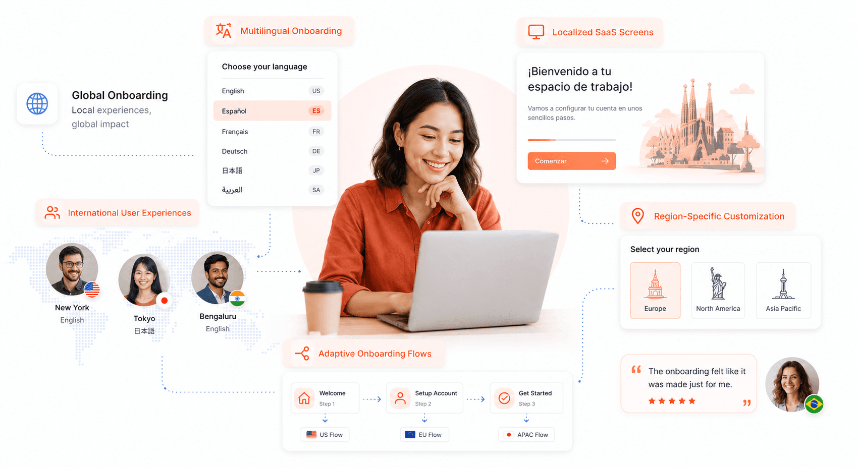
Creating an onboarding experience that works across cultures requires thinking beyond simple translation. Your design decisions must account for different reading patterns, visual preferences, and interaction styles that vary significantly around the world. For instance, Arabic, Hebrew, Persian and Urdu are written from right to left, which means your entire interface layout needs to adapt, not just the text direction.
Color choices carry different meanings across cultures. While white represents purity in Western cultures, it symbolizes mourning in some Asian countries. Red signals good luck in China but can indicate danger or prohibition in other regions. Your onboarding flow should use culturally neutral colors or dynamically adjust based on the user's location.
Typography presents another challenge. Some languages need more space than others. The W3C notes that short English strings such as button labels can double or triple in length when translated into European languages, while Chinese characters need different line heights and spacing. Your design system must be flexible enough to accommodate these variations without breaking the layout.
Navigation patterns also differ globally. Western users expect linear, step-by-step flows, but users from other cultures might prefer more exploratory or hierarchical approaches. Consider offering multiple navigation styles or adapting your flow based on regional preferences.
Cultural considerations to keep in mind when onboarding users
Understanding cultural context goes far deeper than language differences. Personal information collection practices vary dramatically across cultures. In some countries, asking for a phone number upfront is standard practice, while in others, it raises immediate privacy concerns. Check local norms and regulations before deciding what to ask for.
Social proof works differently across cultures too. Western users respond well to individual testimonials and personal success stories, but collectivist cultures prefer group endorsements and community validation. Your onboarding should showcase different types of social proof depending on the target audience.
Authority and hierarchy matter differently around the world. Some cultures respect detailed credentials and formal endorsements, while others prefer peer recommendations and informal validation. The tone of your onboarding copy should match these expectations: formal and respectful in high-context cultures, casual and friendly in low-context ones.
Family and community involvement varies significantly. In some cultures, purchasing decisions involve multiple family members, so your onboarding might need to accommodate shared accounts or family approval processes. Consider how your user flows handle these collaborative decision-making patterns.
Translating and adapting onboarding content for different languages
Professional translation goes beyond word-for-word conversion. Your content needs transcreation: adapting the message to resonate with local audiences while maintaining your brand voice. Humor, metaphors, and cultural references that work in English might fall flat or even offend in other languages.
Technical terminology presents unique challenges. Software concepts don't always translate directly, and you might need to create new terms or adopt locally accepted alternatives. Work with native speakers who understand both the technical domain and local user expectations.
Content length variations require flexible design systems. Translations into French, Spanish or Italian usually run longer than the English source, while Chinese is often more compact. Your interface components must accommodate these differences without compromising usability or visual hierarchy.
Context-sensitive help becomes more complex with multiple languages. Error messages, tooltips, and progressive disclosure need careful attention to ensure they make sense within the local cultural and linguistic context. Sometimes, you'll need completely different explanatory approaches rather than direct translations.
Strategies for creating a localized onboarding experience
Smart content adaptation goes beyond translation to include localized examples, imagery, and use cases. Instead of showing a New York City address format, show local address examples that users actually recognize. Use local currency, measurement units, and date formats throughout the experience.
Regional feature prioritization makes a huge difference. Payment methods vary by market: cards, mobile wallets and bank transfers each dominate in different countries. Your onboarding should highlight the most relevant features for each market first.
Local integration opportunities can accelerate adoption. Connecting with popular regional apps, services, or platforms that users already trust reduces friction significantly. This might mean integrating with WeChat in China, WhatsApp in Latin America, or local banking systems in Europe.
Cultural timing considerations affect onboarding completion rates. Some cultures prefer immediate access with optional setup later, while others want comprehensive configuration upfront. Business cultures might expect detailed feature walkthroughs, while consumer audiences prefer quick wins.
Addressing legal and privacy concerns in international onboarding
Privacy regulations create complex compliance requirements that directly impact onboarding design. GDPR in Europe requires explicit consent for data processing, while other regions have different standards. Your consent mechanisms must be clear, granular, and legally compliant for each jurisdiction.
Data residency requirements affect how you handle user information during onboarding. Some countries require data to remain within their borders, which impacts your technical architecture and user experience flow. You might need different onboarding paths depending on where data will be stored.
Age verification and parental consent laws vary significantly. What constitutes adequate age verification in one country might be insufficient or overly burdensome in another. Your onboarding flow needs to adapt these requirements based on local regulations.
Transparency requirements differ across regions. Some jurisdictions require detailed privacy policy explanations during signup, while others allow simpler acknowledgments. Your onboarding must balance legal compliance with user experience, providing the right level of information at the right time for each market.
Advanced Onboarding UX Strategies and Post-Launch Optimization
Strategies for ongoing user onboarding and retention
The work doesn't stop once users complete their initial onboarding experience. Smart product teams recognize that onboarding is an ongoing relationship, not a one-time event. Progressive onboarding delivers value in digestible chunks over time, introducing advanced features as users become more comfortable with the basics.
Consider implementing milestone-based onboarding that triggers when users reach specific usage thresholds. When a user creates their tenth project, that's the perfect moment to introduce collaboration features. This approach feels natural and contextual rather than overwhelming.
Re-engagement campaigns play a crucial role in bringing back dormant users. Send personalized emails highlighting features they haven't explored yet, or create in-app nudges that surface relevant functionality based on their usage patterns. The key is timing these touchpoints when users are most likely to be receptive.
Seasonal onboarding updates keep your product fresh and give you opportunities to showcase new features. A design tool might introduce new templates at the start of each quarter, while a fitness app could highlight relevant features as seasons change.
Incorporating onboarding into a larger user engagement strategy
Onboarding becomes exponentially more powerful when woven into your broader engagement ecosystem. Your onboarding data should inform your entire user journey, from acquisition through advocacy.
Email nurture sequences can extend the onboarding experience beyond the product interface. A project management tool might send weekly productivity tips that reinforce concepts introduced during initial setup. These touchpoints maintain momentum between app sessions and create multiple opportunities for users to experience value.
Customer success teams benefit enormously from onboarding insights. When they know exactly where users typically struggle, they can proactively reach out with helpful resources. This human touch often makes the difference between a frustrated user and a loyal advocate.
Product marketing should align messaging across all channels with the onboarding narrative. If your onboarding emphasizes collaboration benefits, your case studies, blog content, and social media should reinforce those same themes. This consistency accelerates understanding and builds stronger mental models.
Understanding user behavior and making adjustments to the onboarding process
Analytics tell the story of how users actually interact with your onboarding, often revealing gaps between intention and reality. Heat maps show where users click, scroll, and hover, exposing confusion points that surveys might miss. Session recordings capture the full user journey, including moments of hesitation that indicate cognitive friction.
Cohort analysis reveals how onboarding changes impact long-term retention. Users who completed onboarding in January might behave differently six months later compared to March cohorts who experienced updated flows. This longitudinal view helps separate correlation from causation.
Support ticket analysis provides qualitative context for quantitative trends. When multiple users ask similar questions during their first week, that's a clear signal that your onboarding isn't addressing a common need. Customer success conversations often uncover workarounds users create when the intended path isn't clear.
Behavioral segmentation helps you understand different user archetypes within your onboarding funnel. Power users might race through setup to reach advanced features, while cautious users prefer detailed explanations at each step. Designing flexible experiences that accommodate both preferences improves outcomes across the board.
Dealing with onboarding challenges after the initial launch
Real-world usage always reveals edge cases that testing couldn't predict. Users access your product from unexpected devices, with different browser configurations, or while multitasking in ways that break your carefully designed flow. Building robust error handling and graceful degradation becomes essential.
Technical debt in onboarding code can create maintenance nightmares. What seemed like a quick fix during launch crunch often becomes a complex web of dependencies that makes future updates risky. Regular code reviews and refactoring sessions prevent these issues from compounding.
User feedback volume can be overwhelming after launch, especially when multiple teams want to implement their favorite suggestions simultaneously. Establishing clear prioritization frameworks helps you focus on changes that will impact the most users while maintaining product coherence.
Cross-functional alignment becomes more challenging as teams grow and priorities shift. The original onboarding vision might get diluted as different stakeholders push for their specific requirements. Regular stakeholder reviews and documented decision-making processes help maintain focus on user outcomes rather than internal politics.
The importance of continuous monitoring and updates for onboarding experiences
Onboarding performance degrades over time without active maintenance. Browser updates can break animations, new user types might have different needs than your original target market, and competitor products can shift user expectations. Regular health checks catch these issues before they significantly impact conversion rates.
Establishing monitoring dashboards with clear success metrics helps teams spot trends before they become crises. Tracking completion rates, time-to-value, and feature adoption rates across different user segments provides early warning signals when something changes.
Version control for onboarding experiences allows you to roll back problematic updates quickly. When a well-intentioned improvement accidentally confuses users, having the ability to revert to a known good state prevents extended periods of poor user experience.
Regular user research sessions keep you connected to evolving user mental models. The language that resonated with users six months ago might feel outdated today, especially in rapidly changing industries like fintech or health tech. Continuous feedback collection ensures your onboarding remains relevant and resonant.
Conclusion
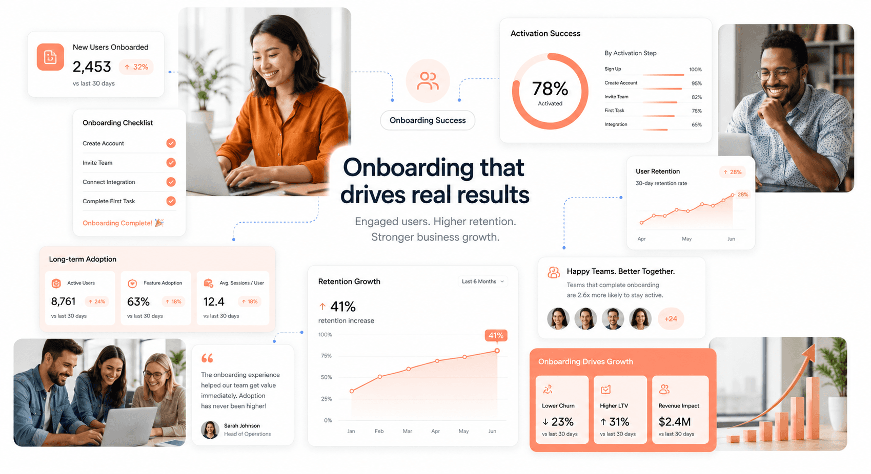
Successful user onboarding is the bridge between initial interest and long-term product success. By understanding your users' needs, implementing the right UX patterns (from welcome messages to persona-based flows) and continuously testing your approach, you create experiences that guide users to their "aha moment" faster. Remember that effective onboarding isn't just about teaching features; it's about demonstrating value and building confidence in your product from the very first interaction.
The journey doesn't end after the initial setup. As your product evolves with new features and updates, your onboarding should evolve too. Keep onboarding going: treat it as an ongoing opportunity to engage users, reduce churn, and drive conversions. Focus on creating experiences that feel natural and helpful rather than overwhelming, and you'll transform hesitant sign-ups into enthusiastic, long-term customers who can't imagine working without your product.
If your onboarding is underperforming and you are not sure whether the problem is the flow, the frontend, or both, book a free assessment. We will diagnose the gap between how good your product is and how good it feels to new users.




About the author
I design modern, user-focused digital experiences that help SaaS products feel intuitive, scalable, and visually engaging. My work focuses on improving usability, simplifying complex workflows, and creating interfaces that increase user satisfaction, trust, and product adoption.
Is a clunky UI holding back your growth?
Is a clunky UI holding back your growth?
▶︎
Transform slow, frustrating dashboards into intuitive interfaces that ensure effortless user adoption.
▶︎
Transform slow, frustrating dashboards into intuitive interfaces that ensure effortless user adoption.
